Mock-ups and a plan before the code
Before the first line of code there were 30 screen mock-ups, a specification with twenty acceptance scenarios and a plan split into stages. Here is what came out of it.
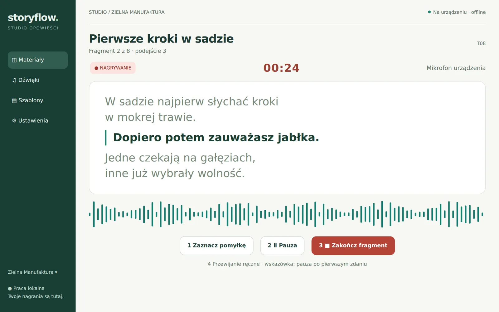
The second post in the series about how Tellavio is being built.
A recording app is easy to start with a “Record” button. It is harder to foresee everything around it. What if the phone rings mid-sentence? What if the author changes the text after recording? How do you move work from a phone to a tablet without a server? That is why we started with mock-ups and a specification.
30 screens before the app existed
The design package from 5 October 2026 has 24 tablet screen mock-ups (labelled T01–T24) and 6 phone mock-ups (M01–M06). They were built as precise HTML and CSS views and rendered to images automatically, so the labels on the mock-ups match the specification. All texts, times and waveforms on them are sample data.
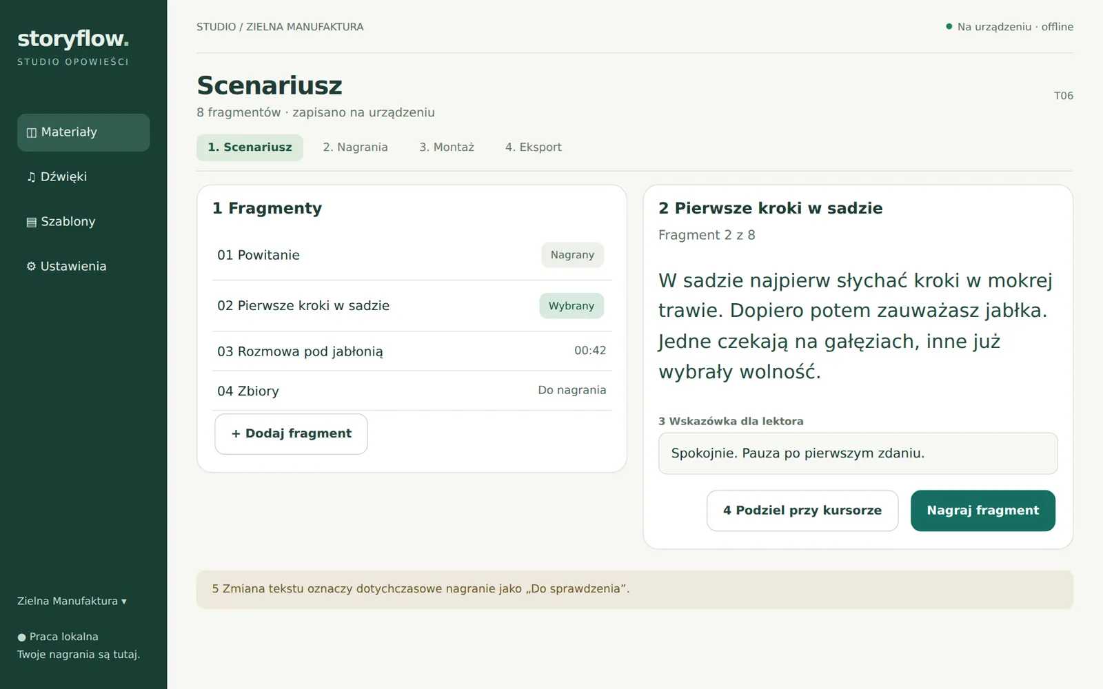
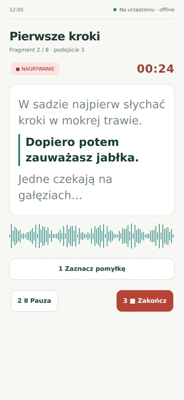
On a tablet the screens have two panels. On a phone the same features fit into a single column, and recording works with one hand.
Paths that are easy to miss
The specification describes not only screens, but also the moments when something goes wrong:
- A slip while reading. You place a marker, pause and read the sentence again in the same take. The marker does not cut anything by itself. Later you listen and remove the bad piece.
- Changing the text after recording. The part is flagged “to check”. The app does not delete the recording and does not pretend that the old file contains the new text.
- A crash or the app being closed. After a restart the app shows how much of the recording it actually recovered.
- Moving work to a tablet. The whole project goes into a single file that you open on the other device as a copy.
On top of that come twenty acceptance scenarios (A01–A20) describing how to verify each of these behaviours.
Colours that mean something
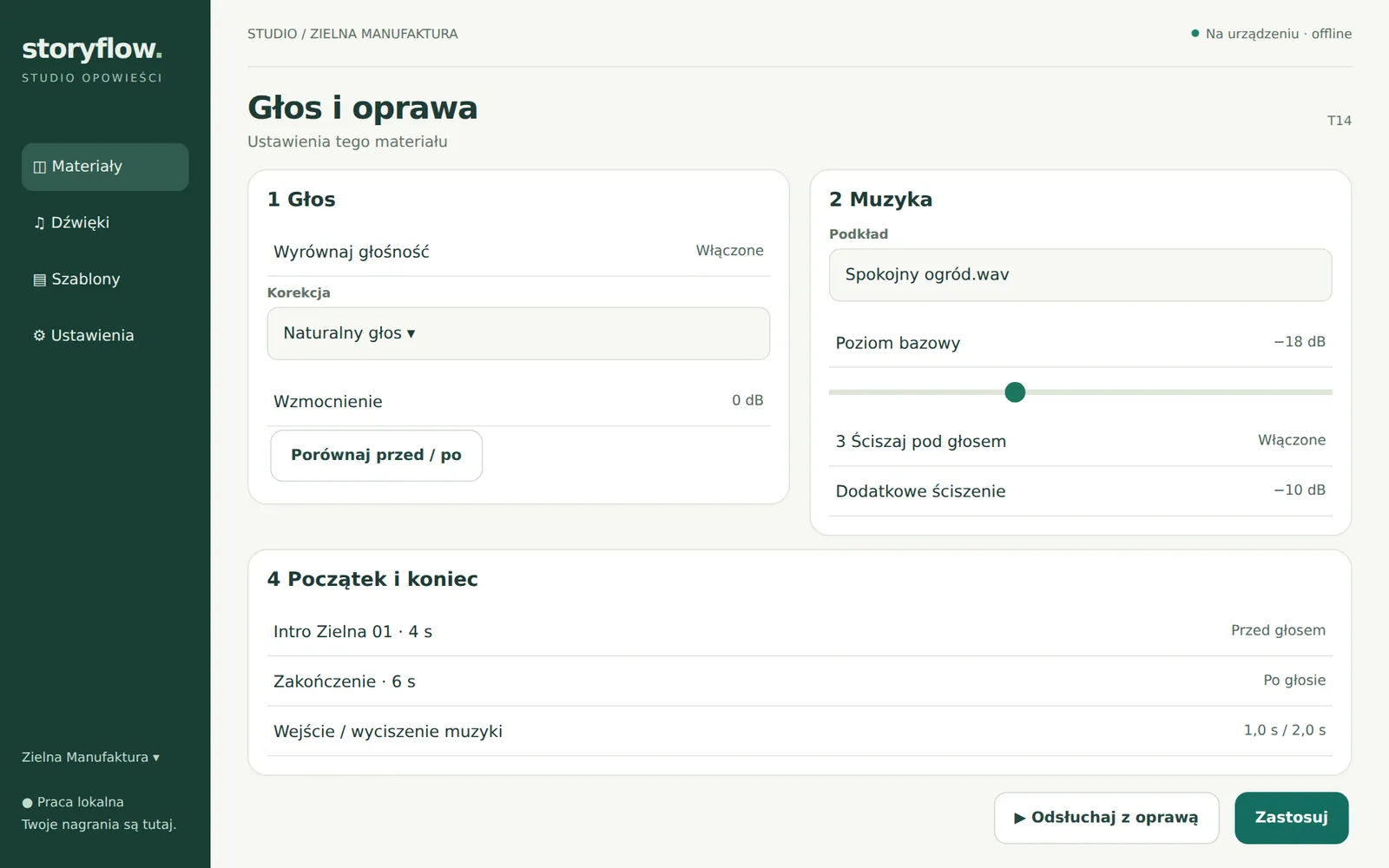
The mock-ups also set the look: a light, warm background that is easy on the eyes when reading, dark green navigation and red only for recording. Voice, music and effects have their own colours (green, violet, amber), but always together with the track name. Information is never conveyed by colour alone, and every button has a name for screen readers.
A plan in one day
Also on 5 October, an eleven-part documentation set was written: requirements, a screen map, architecture, data model, security, testing, the plan, risks and progress. The plan split the work into stages. First a technical prototype to answer the hardest questions about recording. Then a first usable version with all the screens. Finally extras such as backups or publishing. The tasks went into an issue tracker, grouped by version.
The road from mock-ups to a working app turned out shorter than the plan assumed. More on that in the next post, which starts with a question: can a phone record an hour without losing sound?